
Your correspondent has been hard at work wrestling with a database with nearly 40,000 sales going back to pre-pandemic January 2019. Full disclosure: Claude has been my constant side-kick to analyze and deep-dive the data in ways I would never have been able to do before. Conclusions and writing remain my own.
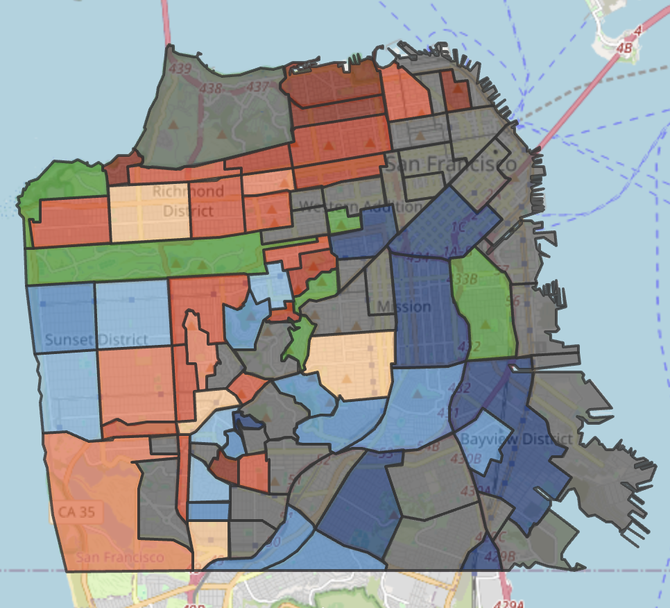
As promised in my last newsletter, here’s a heatmap — actually two — comparing price changes in the condo market between the 6-month period right before the COVID pandemic lockdown in March 2020, and the 6-month period ending in mid-July 2026. (Note these are best viewed on your computer screen, not a mobile device; click on the “full screen button” for the best experience.)
Why these two periods? Because I wanted to see to what extent the city’s condo market has recovered from the exodus that followed the COVID pandemic. It’s well documented that the exodus hit the condominium market hard and the Downtown/SoMa area particularly hard. And there’s been lots of talk of “recovery.” I’ll get to more recent trends in my next post but I wanted to start with a longer-term, city-wide view. And for that, I thought a heatmap might provide a good visual guide to where we are in relation to where we were pre-COVID.
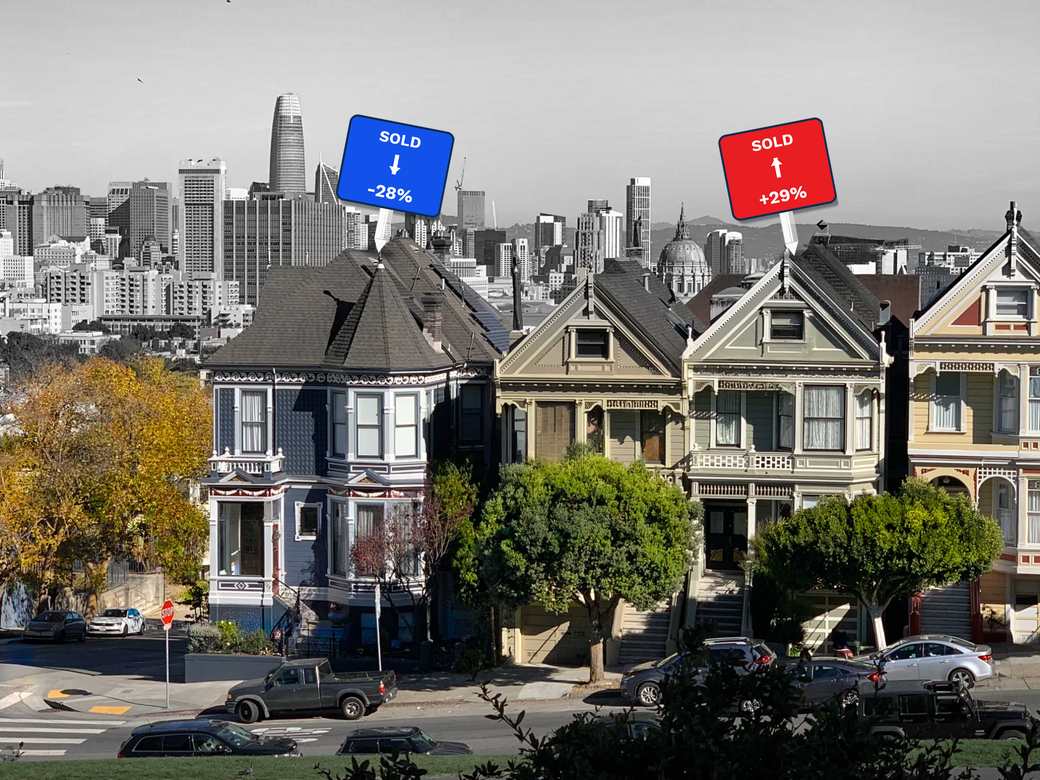
The first chart above compares median sales price for the two periods; the second compares median sales price per square foot. At a glance, the Sales Price Heatmap simply reveals much more color variation, with a mix of up (red) and down (blue) subdistricts. This is especially so in the Downtown/SoMa area that’s outlined in navy blue. Continue reading “SF’s Condo Market since COVID: Location Matters – Except When it Doesn’t”