
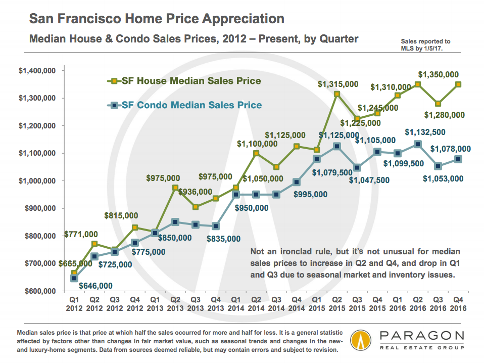
The data is now in for 2016 and we have sliced and diced it to perfection. The results? Single family homes are on simmer, with median prices up a “mere” 6% over last year. City-wide, houses hit $1,350,000 in the last quarter of 2017, an all-time high. Meanwhile condominiums are going sideways. At $1,078,000, they were down about $25,000 from a year previous. In fact, their median price is effectively the same as it was at the start of 2015.
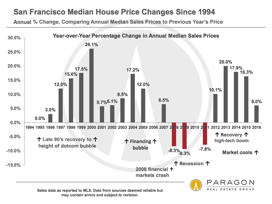
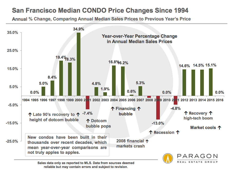
Here’s another look at the appreciation rates for houses and condos in recent years. Clearly, double-digit gains are not sustainable forever.
Not Hot, Not Cold
The overall cooling of the market — and the fact that condos are cooling more than houses –shows up in a wide range of statistics. Here are a couple of my favorites. The first shows how many homes are selling over their final list price. The second shows how much they’re selling for over the list price.
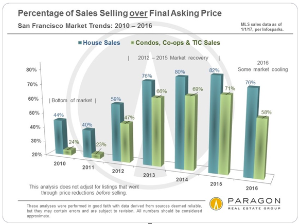
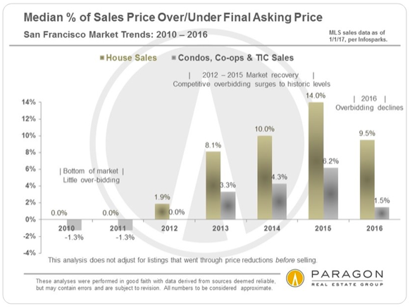
So let’s be clear: even with condos cooling off, last year 58% of them received overbids. The amount of the overbid, however, has declined markedly so that now on a $1 million condo, an overbid might be “just” $15,000. Meanwhile, 76% of houses are receiving overbids and they’re still around 10% over list price.
Will the cooling trend continue? Right after election day, I discussed what a Trump administration might mean for San Francisco’s real estate market. Now that he’s been in office for a week, I think it’s more prudent to say “who knows?” While my views haven’t changed about why Trump and the Republicans should generally be “good” for a real estate market like ours where only the well-off and wealthy get a seat at the table, it seems to me that the dangers that uncertainty injects into any market just got a lot “bigly-er.” Witness Monday’s slump in the stocks.
Getting Granular
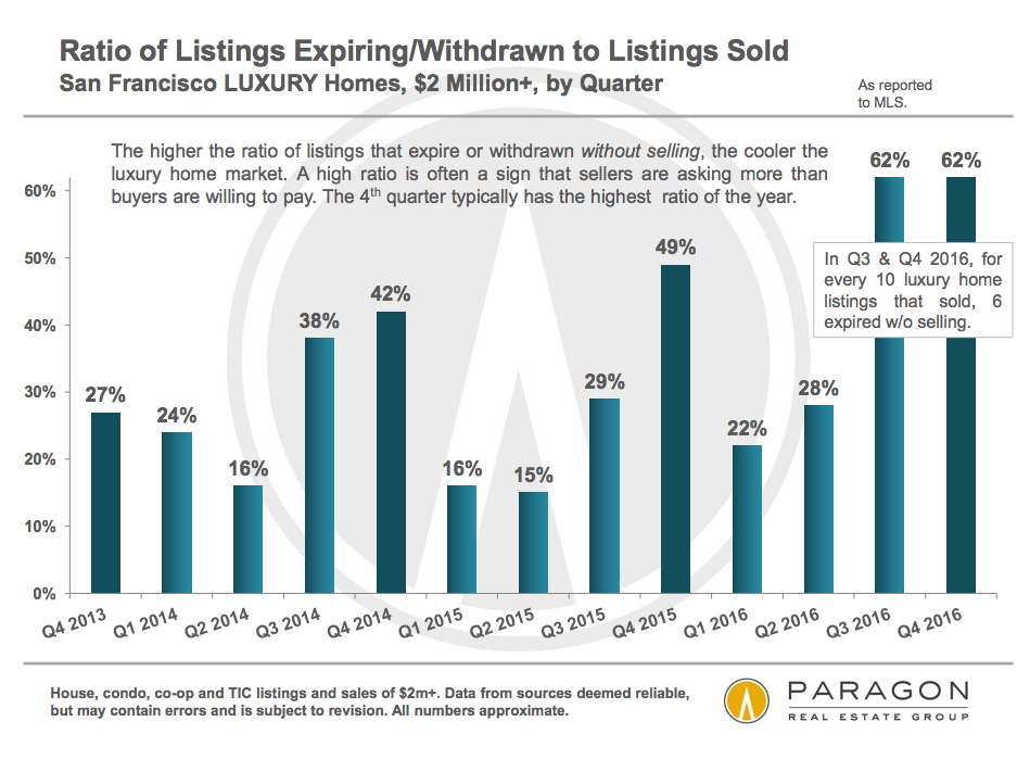
Not all neighborhoods or price segments are performing equally. Broadly speaking, more expensive properties are seeing weaker demand than more affordable properties. You can see this most clearly in the following charts that track the percentage of listings that expire or are cancelled without a sale. The first chart is for the overall market; the second focuses on properties that listed for $2 million or more: quite a difference!

Correspondingly, the more affordable neighborhoods saw decent price growth for single family homes, while home prices in the more luxurious neighborhoods plateaued. Ie. “Go West” and Go “South” for value. (In the first chart, imagine same-colored bars stacked beside each other to see prices changing over time. The second chart does a clearer job for high-priced neighborhoods.)
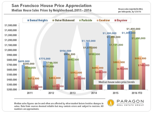
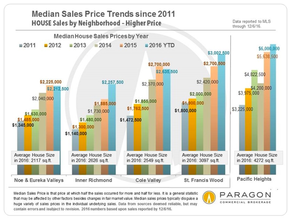
Consider the statistics in the second chart with caution: there tend to be fewer sales in these ritzy neighborhoods and there can be wide discrepancies in sales prices that can throw the numbers off. (No, we don’t believe that Inner Richmond prices really jumped 20%.) Statistically speaking, the most reliable data is for Noe & Eureka Valleys, which have a high number of sales: The median sales price there has basically plateaued from 2015 to 2016.
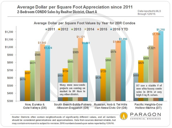
Condominium prices have flattened more uniformly across the city, but MLS District 9, which includes all the new construction taking place in SoMa, Mission Beach, etc, has dropped the most: around 5% from last year.
For my readers who just can’t get enough of this stuff, we have lots more charts here and here. For everyone else, I’ll be breaking it down into bite-sized chunks over the coming months.
As always, your comments, questions, and referrals are much appreciated!
Misha
Great informative read. Love the mix of data and user-friendly graphics. Looking forward to seeing how these trends progress over the month.