Happy New Year everyone! As promised, here is a link to Paragon’s comprehensive analysis of trends in the San Francisco residential market and beyond in 2012. You’ll find 19 incredible charts and maps covering a host of metrics and I highly recommend a quick scan of the online newsletter to find the stuff that might interest you. I’m going to cherry-pick just a handful of my favorites to discuss below.
Home Sales by Price Segment
San Francisco Neighborhood Home Prices by Price Segment These charts show the breakdown of San Francisco home sales as reported to the Multiple Listing Service in the first six months of 2012. The analyses are sorted by city district by … Continue reading →
The San Francisco Luxury Home Market
A Market Overview The luxury home market in San Francisco – typically defined as houses, condos, co-ops and TICs selling for $1,500,000 or more – experienced a big surge in activity in the second quarter of 2012. Below are a … Continue reading →
Absorption R.I.P.
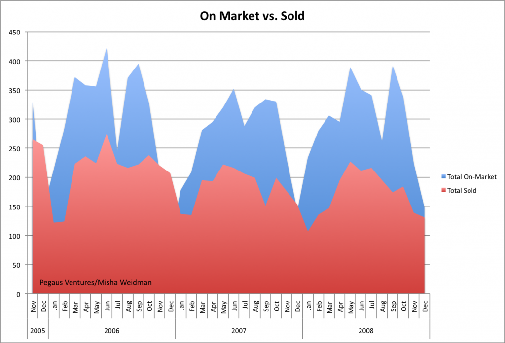
After talking to people about my last post on Absorption Rates and the lack of a correlation between slower absorption and lower median prices (or faster absorption and higher prices), I got the impression that there was some curiosity — skepticism? — about the underlying numbers. So I thought a post mortem of sorts was in order. Here’s a chart that simply tracks total listings and total sales over a little more than the two years covered by the Absorption Rate chart.
 ...
...

