
Noe Valley? Bernal Heights? Those are so yesterday. Maybe you’re thinking Bayview/Hunter’s Point as people search out more affordable housing at the city’s edges.
Well, you’re right about the edge but wrong about the direction. Based on our recent analyses, San Francisco’s “hottest” neighborhoods are also some of its foggiest: go west to the Sunset and its more southerly counterpart, Parkside.
Now admittedly, together these comprise a lot of smaller neighborhoods. Many would object to, say, the Inner Sunset with its vibrant retail scene centered on 9th Ave and Irving, being lumped in with the quieter environs of the Outer Sunset. Fair enough: our analysis is really of MLS Districts, rather than individual neighborhoods, but it’s no less telling for that.
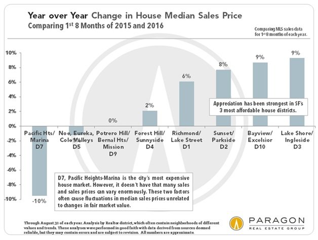
Since the market recovery began in 2012, various districts have taken the lead as the hottest markets in San Francisco: The affluent and prestigious Noe-Eureka-Cole Valleys district and Pacific Heights-Marina district led the recovery out of recession. Later South Beach/SoMa, Hayes Valley and, especially the Mission, went white hot. In mid-2015, price appreciation in many the more expensive and fashionable districts started to plateau.
With the search for affordable homes, and houses in particular, becoming ever more challenging, the greatest pressure of buyer demand moved to a lopsided curve of historically less expensive neighborhoods running along the western-most edge of the city from Outer Richmond south to Lake Merced, then east across the southern border with Daly City, and up through Bernal Heights and Bayview. Of these, we believe Realtor District 2, Sunset/Parkside, with its quiet streets and low crime rates; its closeness to the beach, GG Park and highways south to Silicon Valley; and its attractive, modest-sized houses built mostly in the 1930’s and 1940’s, is now the hottest, most competitive market in San Francisco.
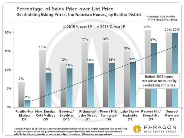
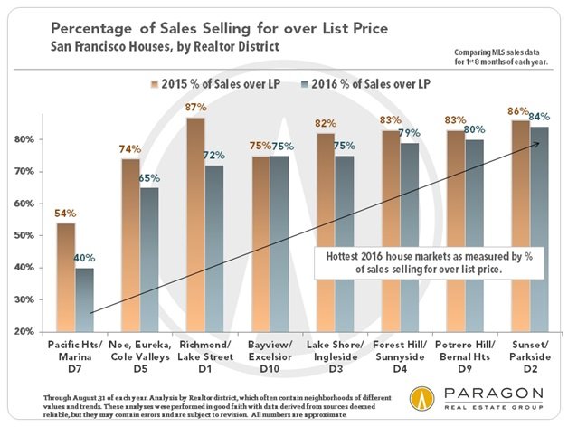
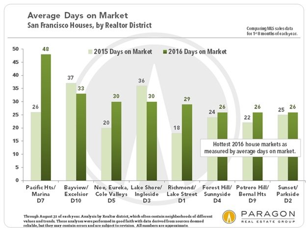
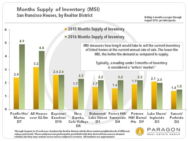
We looked at 5 classic market metrics: percentage of sales price to list price, percentage of listings selling above list price, year-over-year median price appreciation rate, average days on market and months’ supply of inventory. As you can see below, Sunset/Parkside led the way on four of those and came in a tight third on the fifth (price appreciation).
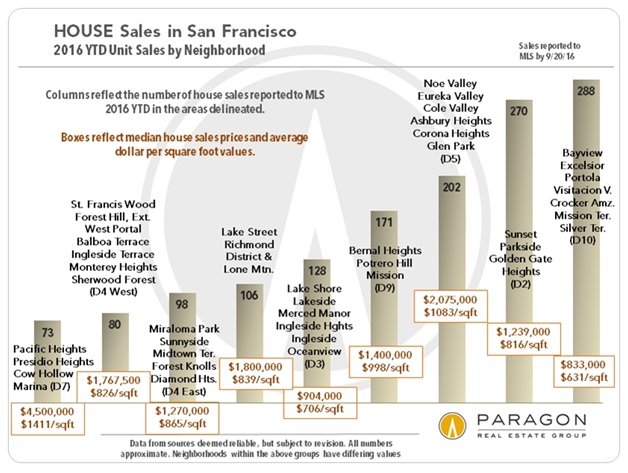
Here’s a chart that shows a lot of information about each district and its core neighborhoods. It’s a bit messy, but useful nonetheless. Note the median sales prices and average price per square foot in the boxes.
And I’ll conclude with a broader look at SF’s trajectory since the recovery began in 2012. As I reported back in April, condo prices have clearly flattened, beginning with the Q2 of 2015. It’s too soon to draw conclusions about house prices, where the seasonal falloff in high end sales during the summer almost always results in a dip in Q3 prices.

As always, your comments, questions, and referrals are very much appreciated.
All the best,
Misha
This is very interesting, Misha – thanks for sharing this data. The market can easily surprise those who don’t keep up. Have a great day!