This month we are looking at SF’s white-hot new construction condo market, but rather than doing the usual chart-heavy newsletter post, I thought I’d see whether having yours truly explaining the charts via a video blog might work better.
I’ve tried mightily to keep the videos short – in fact I’ve broken down the presentation into two separate videos of around 4 minutes each. The first one covers what’s being built and where the primary areas of development are located. You can find it here:
The second one covers how much condos are selling for, with details on a few of the new landmark high-rises dotting the skyline.
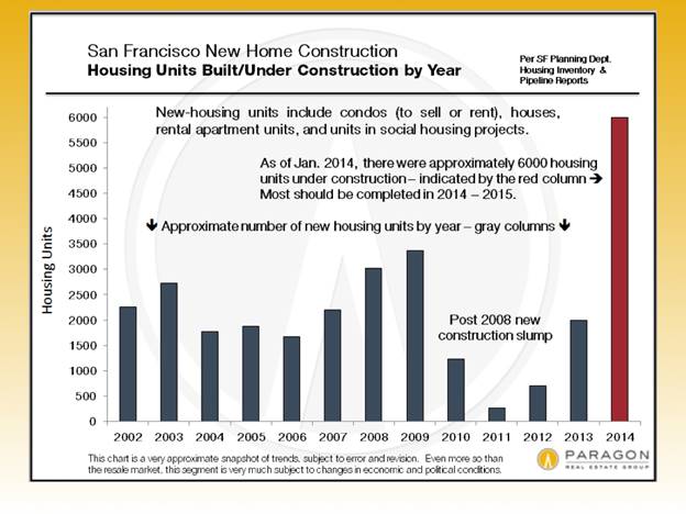
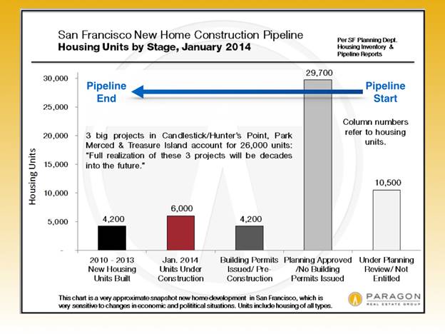
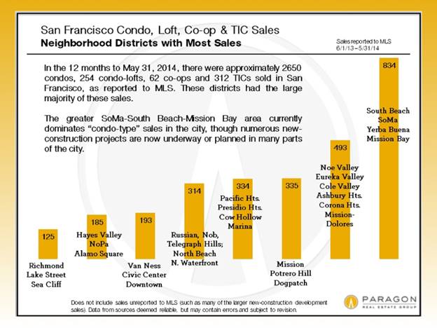
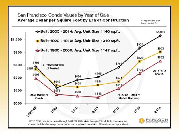
Below are all the charts used in these two presentations, in case you’d rather just do your own analysis. Otherwise, please take a look at the videos and let me know what you think! Is this a good way to present the data or do you prefer the good ol’ written word?