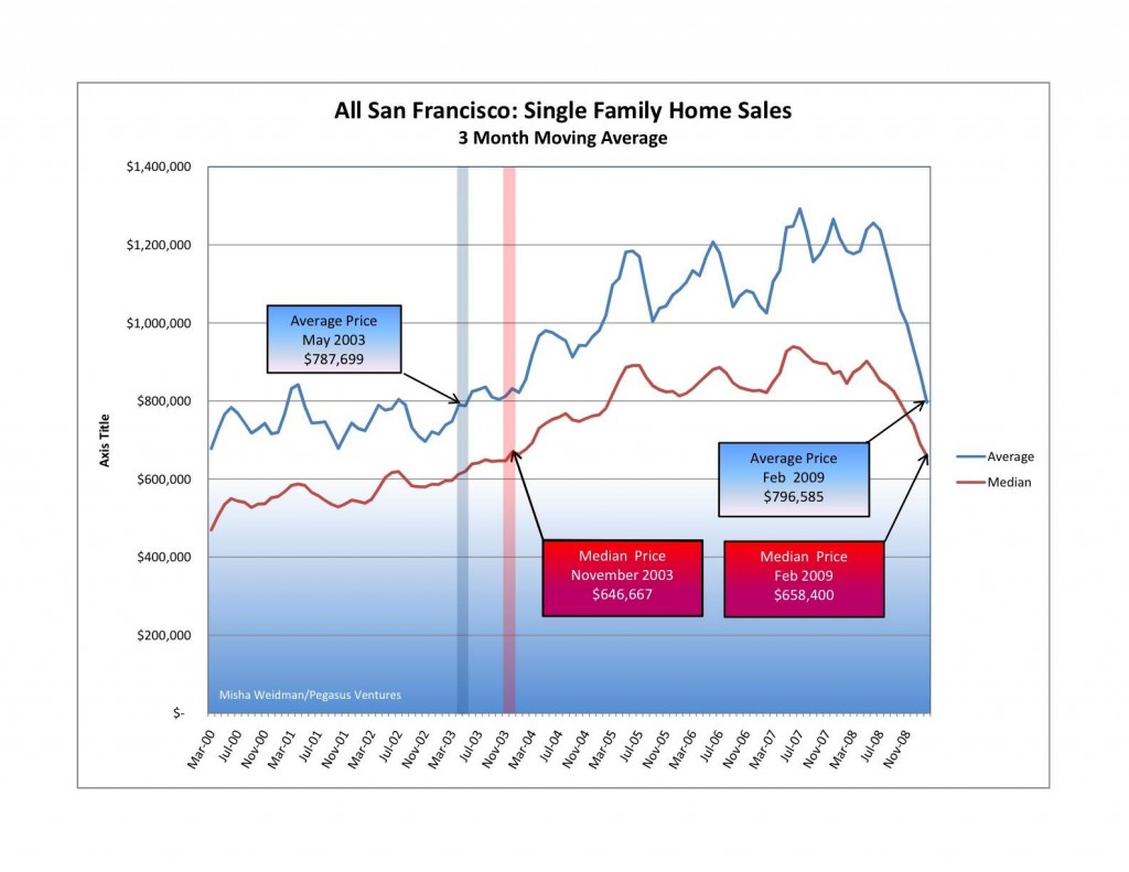
SF Home Prices at 2003 Levels

Sorry, folks, but it’s that bad — or good, depending on your perspective.

I tracked average and median prices going back to 2000 for the ten combined MLS districts that comprise the San Francisco Multiple Listing Service — the big database that realtors use to list properties and record sales information .  (The MLS District Map is here, on my Market Trends page.)  Here are the results (click to make the chart bigger):

san-francisco-price-trends-2000-presentsmall

Pretty scary stuff, especially when you look at the suislide (a new word is born?) that started in June of last year and shows no signs of slowing down. ...  Additional Details

DOM Roll Please

A couple of posts ago, we dispensed with Absorption Rate as a good barometer of the market since there appeared to be no correlation between how much inventory was available in relation to sales rates and where median prices were going.  I asked whether there might be a different metric that would correlate better, like the oft-quoted Days on Market or “DOM.”

In essence, DOM tracks the average number of days that properties have been on the market from the time they became active on the MLS (Multiple Listing Service used by realtors) to the time they actually sell. ...  Additional Details

Absorption R.I.P.

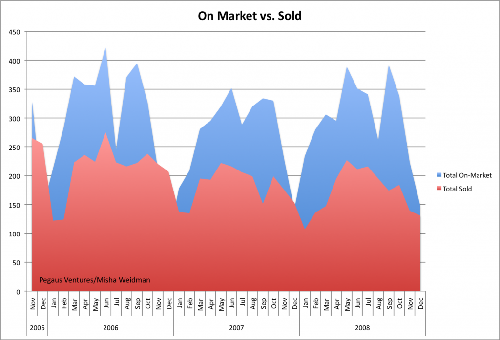
After talking to people about my last post on Absorption Rates and the lack of a correlation between slower absorption and lower median prices (or faster absorption and higher prices), I got the impression that there was some curiosity — skepticism?  — about the underlying numbers.  So I thought a post mortem of sorts was in order.  Here’s a chart that simply tracks total listings and total sales over a little more than the two years covered by the Absorption Rate chart.
on-market-vs-sold ...  Additional Details

Skip to content