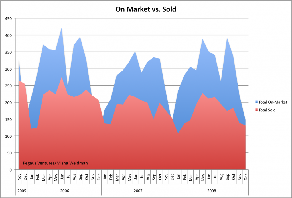
After talking to people about my last post on Absorption Rates and the lack of a correlation between slower absorption and lower median prices (or faster absorption and higher prices), I got the impression that there was some curiosity — skepticism? — about the underlying numbers. So I thought a post mortem of sorts was in order. Here’s a chart that simply tracks total listings and total sales over a little more than the two years covered by the Absorption Rate chart.
 ...
...

