Fears of a New Chill In Home Sales

winter home

That was the title of an October 27 article in the New York Times, and, as one of my readers and clients pointed out, it’s what I’ve been tentatively suggesting as a possible scenario for this winter. See here, for example.

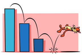
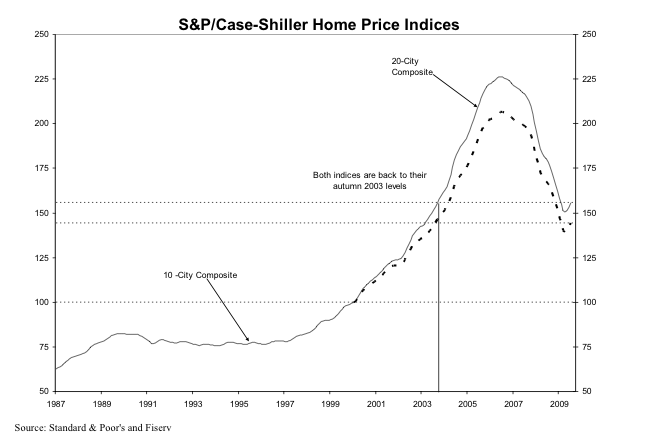
And, ironically, the gloomy head-line announced yet another “positive” month of data from the Case-Shiller Home Price Index. The little up-tick in the index from last month’s July data that I discussed as a possible “dead cat bounce” continued in August.

Picture 4

“San Francisco”  — remember, this is a Metropolitan Statistical Area (MSA)  consisting of 5 of the 9 Bay Area Counties — improved 2.6% on a seasonally adjusted basis from July 09.  The New York Times has a cool inter-active chart that shows the CS Index for various MSA’s here.

So why so glum?  The NY Times article points to a number of factors that suggest the improvement may not continue:

  • an unexpected fall in consumer confidence in October.
  • the end of the stimulus provided by the first-time home-buyer tax credit (though there’s pressure to extend this).
  • doubt about how long the The Fed will keep interest rates so low.

Especially troubling for California is “strong evidence that foreclosures may be spreading from sub-prime inland areas to the more exclusive coastal region.”

My view hasn’t changed.  If you’re thinking about buying, this is probably a good time to be out there looking, with a view to buying some time during the winter months when activity slows and prices tend to soften somewhat.  Nobody knows how long interest rates are going to remain low — and some economists think that they may well remain low for a while — but with the government having thrown so much money at the economy to keep us from the brink of disaster, it’s hard to argue that the long-term trend is going to be anything but up.

As for whether we’ve hit bottom yet, it’s anybody’s guess.  While Mr Case of Case-Shiller continues to think that the worst is over, the NY Times article quotes another eminent economist who thinks that the recent improvement in the CS Index is an aberration and who wouldn’t be surprised by another — if limited — down-leg.

It’s a fool’s game to try to time the market to the nth degree.  And in this environment, with so many contradictory signs pointing in so many directions, you might as well flip a coin, or an economist, and see whether he lands on his head or his arse.

Me, I’m dusting off my magic 8-ball.

magic_8_ball_3

One of the Other Things I Do: Windsor Live+Work

I’ve been itching to do some posts and I have some interesting info coming on TICS (Tenancy-In-Common Interests) vs.  condos.  However, the last few weeks have been taken up readying my development project, Windsor Live+Work, for a major re-submission to the Town of Windsor (we’re talking just north of Santa Rosa, folks, not the seat of the British Monarch).  Windsor Live+Work is a 12 unit live/work project that combines some beautiful and innovative architectural design with forward-thinking urban planning ideas and “green” construction standards.  Here’s the 3D rendering, which I received just last week (click — it looks really good big!).

Windsor Live+Work
Windsor Live+Work

Stay tuned for new posts and charts in the next few days.

Enough about Owning — How about San Francisco Rentals?

I came across a site recently that not only provides a database of available rental units for many US cities, but also has nice, easy-to-read charts on rental trends for specific areas.  Unfortunately, you can’t get very precise in terms of zip code or neighborhood, but it certainly give you a good sense of rental trends.  And trends, as we all know, are what it’s all about!

Welcome to RentBits.com:

I’ve added them to my blog-roll.

Dead Cat Bounce?

deadcatbounce

At the end of last month, the media was full of Case-Shiller’s upbeat report on the national housing market for July 2009, its most recent reporting month. Three months of improving sales “continue to support an indication of stabilization in national real estate values,” according to the September Report.

Here’s the chart, by the way, which also shows that on a national basis we are back to Autumn 2003 price levels.

Picture 3

See that little up-tick at the very end of down side of the mountain?  That’s what every one is celebrating, folks.  Indeed, it’s hard not to laugh when the Report includes tortured phrases like “the rate of annual decline … seems to be decelerating”  or “all metro areas are showing an improvement in the annual rates of return, as seen through a moderation in their annual declines.” Whoopee!

Locally, “San Francisco” — keep in mind that for the CS Index, this means 5 of the 9 Bay Area Counties — posted its fifth straight gain, with a seasonally adjusted gain of 2.9% over June 09, which followed a seasonally adjusted gain of 3.2% in June over May.  Before you break out the champagne, “San Francisco” was still down 17.9% year over year.

This is now old news.  But in this Sunday’s New York Times, Mr. Shiller mused about what all this meant for the real estate market. The article is not a model of clarity, but Shiller’s conclusion is pretty stark:  “At the moment, it appears that the extreme ups and downs of the housing market have turned many Americans into housing speculators.”  He suggests that people are looking at the huge amount of money the fed is pumping into the system, the first-time home-buyer tax credits, and other short-term infusions, and basically “trying  to time their home-buying decisions” and thus artificially causing the spike in prices. Here’s the takeaway:   “The sudden turn could signal a new housing boom, but it is more likely just a sign of a period of higher short-run price volatility.”

Indeed, after noting that the recent change in direction in the CS Index is the sharpest he’s ever seen, he takes a look at the last time a similar turnaround occurred.  It was at the end of the last housing bust, after the 1990-91 recession.  Five years later, however, home prices were down 13.8% in inflation-adjusted terms from the highs they’d reached in the “turnaround” month.

Meanwhile, the stock market continues its giddy gains — perhaps for many of the same reasons as the housing market has bounced back.

Personally, I’m not terribly fond of cats, but if I owned one I’d be keeping it away from any open windows.

“Misha’s Musings” Becomes “Real Data SF”

And now a brief announcement from your sponsor….  I managed to snag www.realdatasf.com a few months ago in what, if I recall correctly, was a brief moment of late-night single-malt-scotch-induced inspiration.  Though I cannot deny the allure of the alliterative, “Misha’s Musings” was always meant as a place-holder till something better came along.  For those of you who are sorry to see the old name go, keep in mind that the new one has 33.33% less characters to type.

Noe Valley By the Foot

Author: Jack French -- Used under Creative Commons Permission 2.0

As I mentioned in my previous post, I’ve had several questions about per square foot prices recently.  There’s no doubt that it’s a very useful metric, for the obvious reason that it allows you to get closer to an “apples to apples” comparison of the value of two different properties that are different in size.  Of course, that leaves all sorts of other variables — location, amenities, etc.  But if, say, you’re looking to make an offer on a property, certainly you’d want to start by looking at what other properties in the same area have been selling for on a per square foot basis, and then use that to see if the property you’re interested in is in the ballpark.

Since I live in Noe Valley, I’ll readily admit that I tend to follow my neighborhood more closely than other areas.   No great surprise there.  So here, without further ado, is a chart showing the price per square foot for single family homes in “core” Noe Valley (click to enlarge).

Noe Valley Price Per SF

Rather than run the chart as Percentage Change From All-Time High, as I usually do, this simply shows price per square foot as a 3 month moving average.  I’ve added the  “number of sales” per month, plotted on the right-hand axis as well.   Note that low monthly sales volumes ( no surprise, given the small geographic area) will make the data less statistically reliable.  In most months, there are less than 15 sales.

While we’re on the subject of sales volume, I recently read an advertisement in the local rag, The Noe Valley Voice, from a local real estate company touting how sales volume in Noe Valley is up, compared to San Francisco as a whole.  So what?  As I’ve stated before in the context of the luxury home market, I really haven’t found any correlation between volume and price.  Though it may be a little difficult to tell from this chart, I don’t see it here either.  For example, sales volumes were down and falling during the autumn months of 2007, but that’s when prices started climbing towards their all-time high in early 2008.  Likewise, sales volumes were increasing through the first 6 months of 2008, even as prices were sliding.

The bottom line is that Noe Valley homes are still fetching north of $700 a square foot, and that’s after a protracted slide.  Sure, the price per square foot is  down substantially from the near- $900 a foot that they hit back in January 2008, but it’s a pretty well-heeled foot nonetheless.